18 Best Family Photo Color Schemes to Communicate a Warm and Vibrant Vibe
Updated on November 19, 2025
Family photo color schemes reflect the warm and vibrant atmosphere of a close-knit family. It can be based on a variety of factors, such as the season in which the photo was taken or the mood that is being conveyed. Get the color scheme right, and your photos will look amazing. Get it wrong, and they’ll look washed out, flat, and uninspiring.
Thankfully, choosing the perfect color scheme for your family photos is not as difficult as it may seem. With a little bit of planning, you can easily create a cohesive and visually stunning look that everyone will love. This article guides you through everything you need to know about family photo color schemes.

What are the best color schemes for family photos?
There’s no shortage of choices when it comes to family photo color schemes: black and white, sepia tones, pastels, jewel tones, or a mixture of various colors to create an eclectic style. Here are some of our favorite color schemes to pick for your family photos:
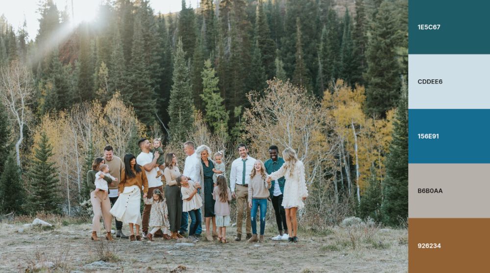
1. Olive green and black
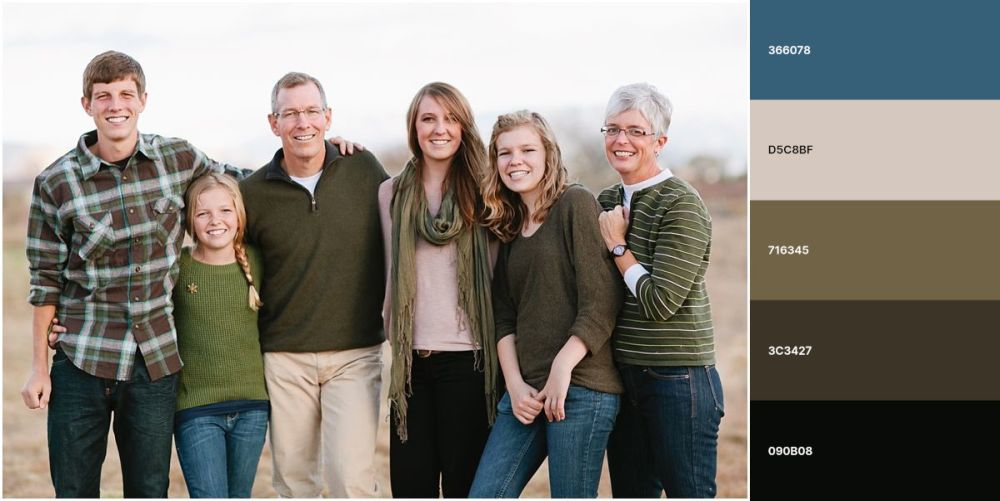
Olive green and black make the perfect color scheme for fall family photos. The olive green complements the natural colors of the leaves, while black and white clothing creates a classic look.
Note that you don’t have to use olive green and black colors exclusively. You can mix and match different shades of green, black, and white to create a unique look for your family photos. However, we recommend avoiding using too many colors, as this can be overwhelming.
Check outKristen Duke Photographyfor more inspiration.
2. Black and white
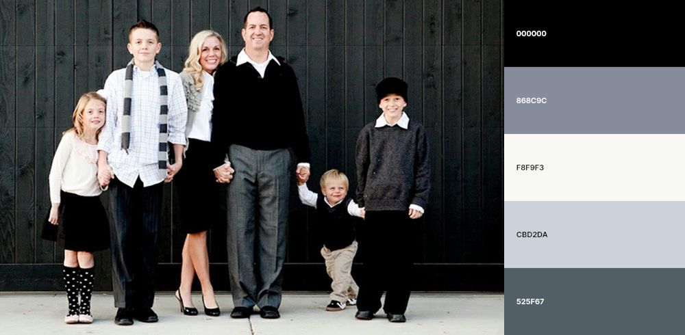
Black and white make a classic, timeless color scheme that’s easy to coordinate for family photos. You can dress everyone in black and white or use a mix of colors and convert your photo to black and white after it’s been taken.
The versatility of black and white means that you can use this family photo color scheme in any season. For example, in summer, you can dress everyone in brightly colored clothes and convert the photo to black and white. This will create a beautiful contrast between the colors of your clothing and the black-and-white background.
The black and white combo doesn’t necessarily apply to clothing exclusively, so it’s best to experiment with color variations, such as ivory, off-white, pale gray, or charcoal gray, to see what works best for you and your family.
Check outKristen Duke Photographyfor more inspiration.
3. Denim, peach, and blue
Denim, peach, and blue create a fantastic color scheme for spring and summer family photos. The denim gives photos a casual feel, while the peach and blue add a touch of playfulness. In the fall or winter, you can replace denim with dark-colored clothing.
Make sure to consider your surroundings since the family photo color scheme you use should complement the setting.
Check outKelly McPhailfor more inspiration.
4. Red, gray, and mustard yellow
Red, gray, and mustard yellow create a great color scheme for outdoor family photos. The red adds a pop of color, while the gray and mustard keep the photo from feeling too busy.
You can use the red, gray, and mustard yellow color scheme for indoor family photos, too. Just make sure to choose a room with plenty of natural light to showcase the colors.
The season that brings the best out of this family photo color scheme is fall or winter. For instance, red, gray, and mustard yellow go well together for Christmas family pictures.
We found this cool idea in thisPinterest post.
5. Pink, tan, and cream
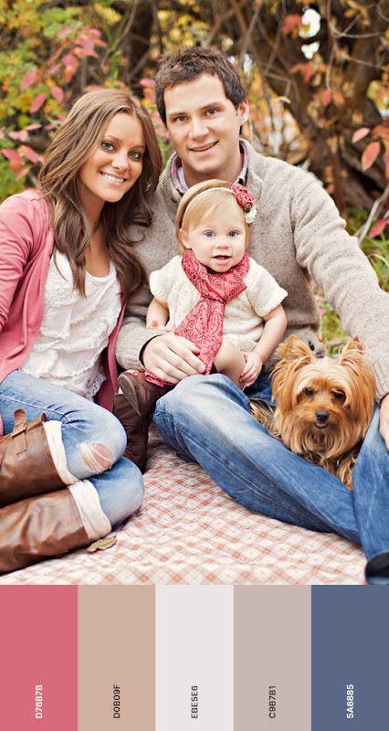
Pink, tan, and cream create a light, soft color scheme suitable for family photos when you want to draw attention from a busy background. The cream helps to brighten up the pictures, while the pink and tan add a touch of femininity.
This combination works well for indoor family photos since the light colors make a room seem brighter and more open.
While pink, tan, and cream can be used in any season, it’s especially perfect for spring and summer family photos.
Remember that you don’t have to use these colors exclusively. You can mix and match different shades of pink, tan, and cream to create a unique look for your family pictures.
Check outKristen Duke Photographyfor more inspiration.
6. Copper rust and veiled rose
Copper rust and veiled rose add warmth and elegance to family photos, whether they are taken in the fall or winter. The two colors complement the natural colors of the leaves and the setting sun.
When using a color scheme using copper rust, veiled rose, and other colors, ensure these two are dominant and only sprinkle in the others, or you will create a chaotic look.
Check outPhotography by Tasha Rosefor more inspiration.
7. Light gray, baby blue, and soft yellow
Light gray, baby blue, and soft yellow make a cheerful color scheme for spring or summer family photos. The lightness of gray and blue keeps the picture from feeling too heavy, while the softness of yellow adds warmth.
Although light gray, baby blue, and soft yellow are natural for outdoor pictures, you can also see them indoors. Just make sure to pick a room with a lot of natural light, as the colors can seem a little dark when they’re not well-lit.
We got this idea from this Pinterest post.
8. Orange and blue
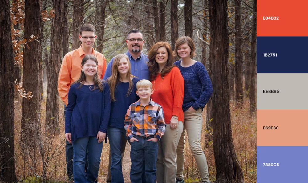
Orange and blue make a fantastic color scheme if you wish to make the family pictures seem like they were taken during the golden hour. The golden hour is the first hour before sunrise and the last hour before sunset.
The orange and blue combination works in autumn and winter.In autumn, the orange hint at the fall leaves, while the blue complement the sky. In winter, orange adds a bit of warmth to the iciness of blue.
When choosing this family photo color scheme,avoid using too much orange, as it can be overwhelming. Blue should be the dominant color, with only a few pops of orange throughout the photo.
Check outJessica Stone Phootgraphyfor more inspiration.
9. Blue and pink
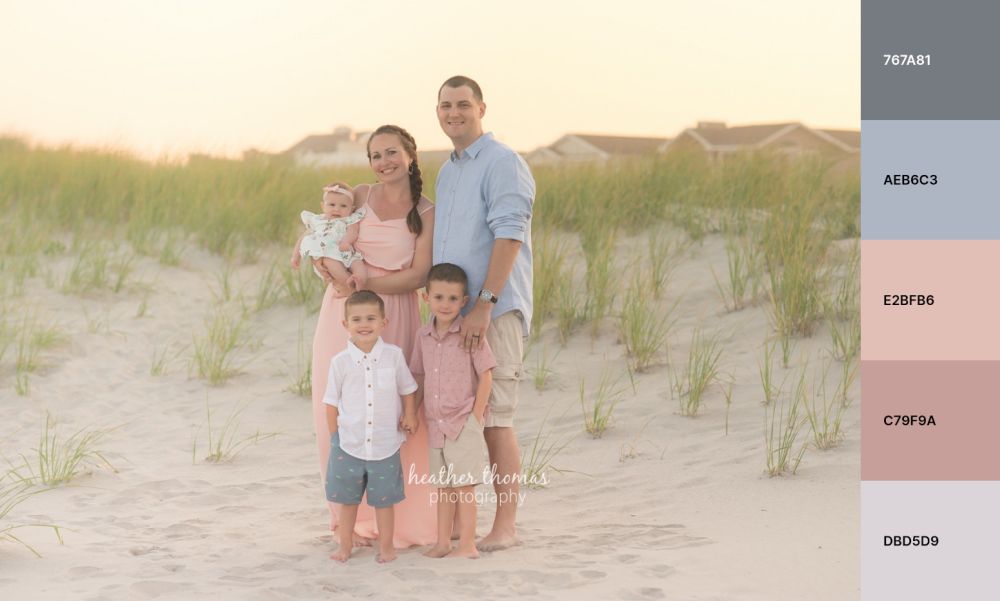
Blue and pink are complementary colors since they’re opposite on the color wheel, so the two naturally go well together. The blue adds a touch of coolness to the photo, while the pink add warmth, balancing out the temperature.
The blue and pink color scheme is ideal for outdoor family photos in the summer or spring, just as a trip down the beach, as the colors complement the beige of sand and the blue of the water. But they can also be worn indoors for a casual photoshoot.Just make sure to use different shades of blue and pink since you don’t want the colors to be too matchy-matchy.
Check outHeather Thomas Photographyfor more inspiration.
10. Black and gold
Black and gold is a classy color scheme that works well for elegant family photos, making them look more formal and expensive. The black evokes sophistication, while the gold instills luxury.
You can also use the black and gold color scheme for a holiday family photo. For instance, black complements Christmas decorations, while gold makes everything feel festive.
When picking the black and gold family photo color scheme, it’s important to balance the colors well. Too much black darkens a picture while too much gold could make it look tacky.
Check outArielle Levy Photofor more inspiration.
11. Burnt orange, dark green, and mustard yellow
Burnt orange, dark green, and mustard yellow make the perfect color scheme for country-themed family photos. The burnt orange adds a touch of warmth, the dark green gives the feeling of rustic sophistication, while the mustard yellow adds a touch of playfulness to the mix.
This color scheme works well for an outdoor family photoshooting session in the fall since the colors complement the natural setting.
To avoid making the photo look too busy, you should use burnt orange as the dominant color and the others as accents.
Check outShanna Michelle Photographyfor more inspiration.
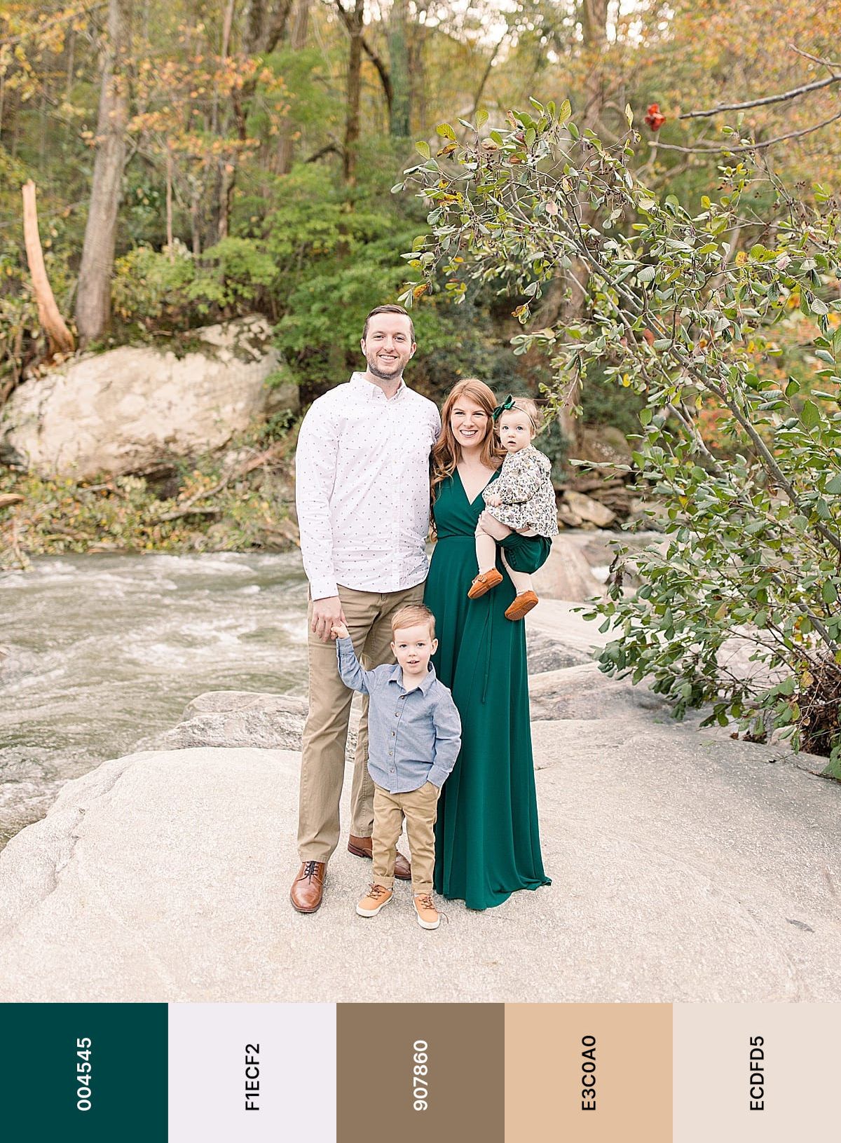
12. Dark purple and emerald green
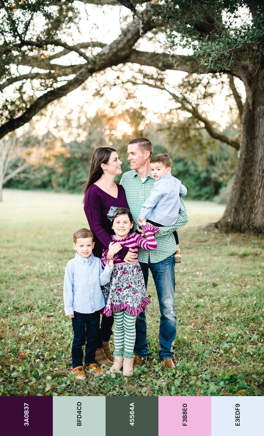
Dark purple and emerald green are complementary colors since they sit opposite on the color wheel, which means that they naturally go well together. These colors are incredibly popular for weddings, so it’s no surprise that they are also a great choice for family photos.
The dark purple adds a sprinkle of elegance to the pictures, while the emerald green makes them seem more playful. You can use the color combination both indoors and outdoors.
To avoid making the photo feel too heavy from a contrast standpoint, you should use a lighter shade of purple.
Both colors can be used as accent colors throughout the photo, so make sure to choose the version that suits you best.
Check outNatalie Zepp Photographyfor more inspiration.
13. Beige with pops of color
Beige with pops of color makes an incredibly versatile color scheme for family photos, regardless of the season and whether they’re taken indoors or outdoors. The color scheme could be for clothing, props, or even the background.
When building a color scheme around beige, be sure the colors youchoose complement each other. For example, you could use a beige background with pops of blue, green, and pink.
Check outKristi Alyse Photofor more inspiration.
14. Green and beige
The green and beige color scheme can work well for family photos, but it greatly depends on the setting you choose.For example, if you’re going for a country-themed family photo, then a green and beige color scheme would work perfectly since green complements the natural setting while the beige adds a touch of sophistication.
Green and beige also work well for an outdoor family photo in the spring or summer. The green complements the foliage while the beige adds a touch of warmth.
If you’re looking to use this color scheme for an indoor family photo, then you should make sure the green is light enough to not overwhelm the photo. The beige can be used as an accent color throughout the photo.
Check outMcSween Photographyfor more inspiration.
15. Navy and pink
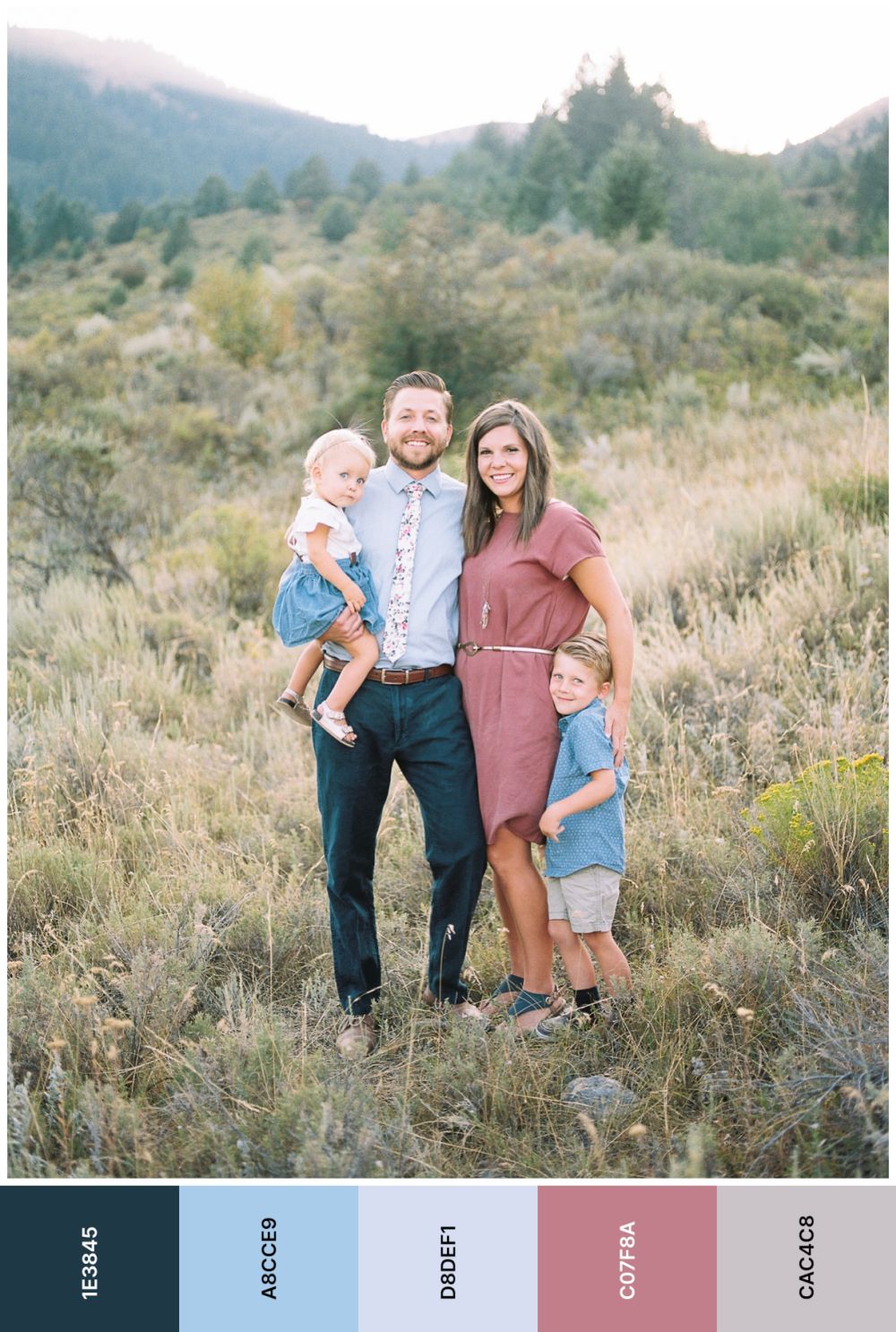
Navy and pink are a great color combination for a summer family photoshooting session. The navy complements the blue of the sky, while the pink throws some playfulness in the mix.
The best part is that you don’t have to wear navy and pink in this exact combination. Instead of matching your clothes to this color scheme, you can use it as a guide for the overall tone of the photo. For example, if you’re going to take an outdoor family photo, then you could dress everyone in white and use navy and pink as the dominant colors in the background. This would create a beautiful contrast that would really make the photo pop. Or you can use navy and pink as the dominant colors in the foreground, with a white background. This would create a more subdued contrast that would be perfect for an indoor family photo.
Check outCasey James Photographyfor more inspiration.
16. Medium gray, ruby red, and emerald green
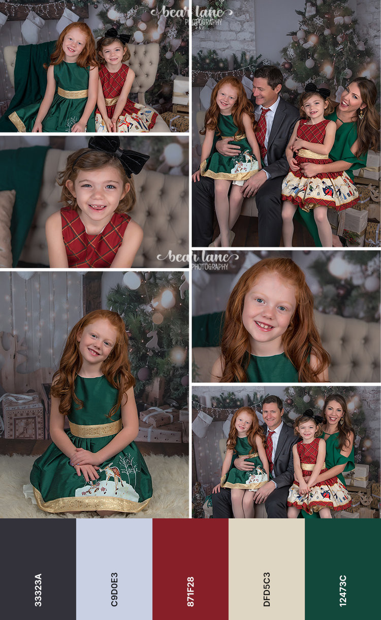
Medium gray, ruby red, and emerald green make an ideal color scheme for holiday family photos. The medium gray gives the photo a touch of sophistication, while the ruby red and emerald green add some festive cheer.
You can use this color scheme in a number of ways. For example, you could use medium gray as the dominant color and ruby red and emerald green as accent colors. Conversely, you could use ruby red and emerald green as the dominant colors and medium gray as an accent.
The medium gray, ruby red, and emerald green color scheme also work well for fall photoshoootings. The medium gray complements the cool tones of the season, while the ruby red and emerald green add warmth.
Check outBear Lane Photographyfor more inspiration.
17. Plaid
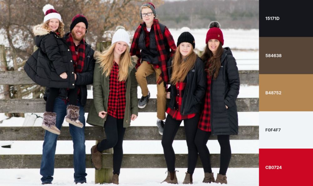
Plaid is perfect for country-themed family photos since it adds a touch of rustic charm and makes the event more memorable. The multi-colored, cross-lined pattern is popular among families who have a lot of children since tartan is a very forgiving pattern that can be easily coordinated.
If you’re going to use plaid in your family photo, then you should make sure that everyone is wearing a different pattern. This will add visual interest and make the photo more unique. You can also use plaid as an accent, like a plaid scarf or blanket in the background of an outdoor family picture. This would add some depth and texture to the photo.
Check outMJ’s Off the Hook Designsfor more inspiration.
18. White and royal blue
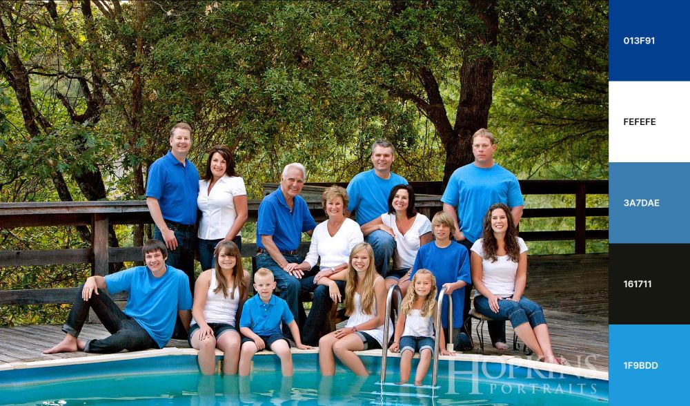
White and royal blue create a fantastic color scheme for summer family photos since the white reflects the heat of the summer sun, while the royal blue adds refreshing coolness. Plus, the white prevents the photo from looking overloaded, making it perfect for large families.
If you want to use this color scheme for an indoor family photo, ensure the blue is light enough so it doesn’t overwhelm the photo. White can be used as an accent. However, the setting depends on the overall tone you’re going for with your family photo. For a more formal photo, an indoor setting is better. For a more casual photo, an outdoor setting is more appropriate.
Check outHopkins Portraitsfor more inspiration.
Tips to choose family photo color schemes
Check out the following tips when picking family photo color schemes:
- For outdoor family pictures, consider the natural colors of the surroundings as your color palette. For example, in fall, you can use earth tones like brown, orange, and red. In spring, try softer colors like pink and blue.
- For indoor family pictures, you can still use the natural colors of your surroundings as inspiration for your color scheme. But it’s essential to use lighting to your advantage. If the room is brightly lit, use light colors to avoid washing out the subjects. On the other hand, if the room has softer lighting, darker colors help to create a more cozying effect.
- When planning a family photoshoot, take care to coordinate the colors of your clothing with the season. For example, if you’re taking a picture in the winter, consider white, silver, and blue. These colors will not only complement the season but also give your family photo a festive feel.
- If you want something a little more unique, try using a jewel-tone color scheme. This is perfect for holiday family photos or for extended family pictures. Jewel tones are also great for creating a luxurious feel.
- Finally, if you’re taking a family portrait, consider using a coordinating color scheme. This means that everyone in the photo should be wearing similar colors. For example, if you have a large, extended family, you may want to use a color palette that includes different shades of the same color. This will create a cohesive look and help to make everyone in the photo stand out.
Things to avoid when picking a color scheme
There are a few things you should avoid when picking a color scheme for your family photo:
1. Patterned colors in clothing
While patterned clothing can be fun, it’s best to avoid it in a family photo since it can be very distracting and make the picture look cluttered. If you absolutely must use patterned clothing, make sure it’s coordinated and not too busy.
Instead of using patterned colors, it’s best to stick to solid colors since they are classic and easy to work with.
If you do decide to use patterned clothing, ensure the colors complement each other. For example, you could use a floral print dress with a plaid scarf.
2. Neon clothing
Neon clothes are never a good idea for family pictures unless you’re all going for an 80s disco theme. Neon colors are very harsh, overwhelm everything else, and make it difficult to coordinate the rest of the colors in the photo.
Additionally, it’s challenging for a photographer to get a good photo with neon since neon colors tend to reflect light.
If you’re set on using neon colors, then you should use them as accents. For example, you could use a neon scarf or hat as an accent color in an otherwise black-and-white photo.
Instead of using neon colors, stick with classic colors like black, white, navy, and gray. These never go out of style and always look chic.
3. Being too matchy-matchy
While it’s important to coordinate the colors in your family photo, you don’t want to go overboard with matching since it can look contrived and forced.
The key is to find a balance between coordinating and matching. For example, you could have everyone wear a white shirt with jeans. This would coordinate the colors without looking artificial.
Another way to coordinate colors without looking too contrived is to let everyone choose their own outfit. Then, you can simply provide a color palette for everyone to follow. This will allow all to express their style while still coordinating the colors in the photo.
4. Overloading the contrast
Using too much black or almost exclusively bright colors can result in an overloaded contrast, making the picture look harsh and unappealing. To avoid this, you should use a variety of colors to create a more balanced and pleasing photo. On the other hand,too much variety will create clutter. So, you must find a balance. A good rule of thumb is to use a maximum of three colors in your family photo. This will allow you to create a cohesive and pleasing color scheme without overwhelming the picture.
5. Not considering your skin tone
It’s essential to take your skin tone into account when finding the perfect color scheme for your family photos, the same way you would acknowledge your skin tone when applying makeup. Certain colors look better or worse, depending on your skin tone. For example, for a warm skin tone, avoid cool colors like blue and purple in favor of warm colors like red, orange, and yellow. For a cool skin tone, avoid warm colors like red and orange in favor of cool colors like blue and purple. Regardless of your skin tone, you can use neutral colors like black, white, and gray.
How do you create a color scheme for family photos?
There are several steps involved in creating a color scheme for family photos:
1. Think about the setting
The environment plays a key role in figuring out the best family photo color scheme: indoors or outdoors, natural or urban, and so on. For example, if you’re taking pictures in a forest, use natural colors like green, brown, and earth tones. In an urban setting, use colors found in the city, such as concrete gray, steel blue, and brick red.
You can also use the season as a guide for choosing colors. For example, fall calls for orange, yellow, and red. Meanwhile, winter calls forwhite, silver, and blue.
2. Choose a color scheme that flatters everyone
Everyone participating in the family photo should feel comfortable, so the color scheme should make all look good.
To figure out which colors flatter everyone, you’ll need to take into account each person’s skin tone.For instance, for a mix of warm and cool skin tones, use a neutral color scheme that includes black, white, and gray. On the other hand, if you have mostly cool skin tones in your family, use a cool color scheme that includes blue, purple, and pink. For warm skin stones, stick to a warm color scheme made of red, orange, and yellow.
3. Coordinate with the clothing
What everyone wears is essential since you don’t want the family photoshooting session to turn into a fashion disaster. So the colors of the clothes should coordinate with the skin stones and setting. This way, you will successfully createa cohesive look that is both stylish and flattering.
The most challenging part of creating a unique color scheme for your family photos is keeping an eye on everything. It’s not enough to coordinate colors with clothing if you fail to consider other important factors like the setting and skin tones. By taking all of these factors into account, you can create a color scheme that is both stylish and flattering. With a little bit of planning, you can make sure your family photos are perfect.
4. Find inspiration in other family photos
If you’re having trouble coming up with a color scheme for your family photo, then you can always look to other family photos for inspiration. There are a few different ways to do this.Firstly, look at old family photos, pick your favorite, and check the colors used to see what looked best in the past. Secondly, look at photos of families similar to yours, like your extended family.
5. Choose a color scheme that reflects your style
Feeling out of place is the last thing you want when paying for an expensive family photoshooting session, so no matter which color scheme you end up choosing, it should reflect your style. For instance, if you’re not comfortable with bright colors, you should pick pastel ones instead.
If you’re not sure what your personal style is, think about the colors that you typically wear: cool or warm, neutral or pop of color, and so on.
How do I find the color scheme of my family photos?
If you have digital copies of your family photos, the easiest way to find out the color scheme is by using an online color picker, such as Image Color Picker. You just have to upload an image and drag a tool over the color you’re interested in to obtain its color hex code. A color hex code is a hexadecimal method for representing a color in the RGB format by combining the amounts of red, green, and blue in a specific shade.
FAQ
Check out more information about family photo color schemes:
Is white OK to wear for pictures?
Yes, it’s fine to wear white in pictures, especially in a black-and-white photoshooting session, since it will help create a striking contrast that will really make your family photos pop. However, you should never white in wedding photos unless you’re the bride.
What is the best color to wear for family photos?
Any colors you and your family feel comfortable wearing are perfect for family photos. If you’re unsure or don’t want to risk ruining the photoshooting session, you can stick to neutral colors like black, white, beige, tan, ivory, and cream since these work well for any skin tone.
What color represents family?
There’s no right answer to this question, as it’s subjective to a lot of different factors. Culture, personal experience, artistic views, and many other things can all play a role in what color represents family to you. However, some colors that are often associated with family are blue, green, and red. These colors can represent different things for different people, but they’re often seen as calming, reassuring, and loving colors.
Conclusion
To wrap it up, the best color scheme for your family photo depends on a number of factors. By taking into account the setting, skin tones, and clothing, you can create a color scheme that is both stylish and flattering. With a little bit of planning, you can make sure your family photos are perfect.
What are your favorite family photo color schemes? Share your thoughts in the comments below!